
Introduction
Have you ever wondered how applications like Chrome, Visual Studio Code, or your favorite IDE seamlessly switch between light mode, dark mode, and custom themes? From a user's perspective, it often feels like a simple toggle that instantly updates the entire interface.
When I first explored this feature, I assumed it was simply a matter of changing a few colors. However, while working on Angular applications, I discovered that dynamic theming involves much more than visual styling. It requires a thoughtful approach to consistency, performance, maintainability, and delivering a seamless user experience.
In this blog, we'll explore what dynamic theming is, the common approaches to implementing it in Angular applications, and the best practices for building scalable and maintainable theme solutions
What is Dynamic Theming?
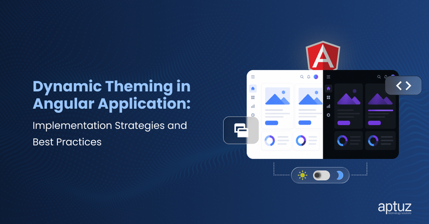
Dynamic theming allows you to change the appearance of your application at runtime, without reloading the page. In simple terms, it means the UI can adapt instantly based on user preference or application state. For example, when a user switches from light mode to dark mode, the colors, backgrounds, and overall look of the application update immediately, without interrupting the user's experience.
Examples:
- Light/dark Mode
- Custom color themes
- Brand-based themes
Why Dynamic Theming Matters
- Improved user experience.
- Better accessibility, including reduced eye strain.
- Increased user engagement.
Now that we understand dynamic theming, let's look at the common approaches to implementing it in Angular applications.
Approaches to Implement Dynamic Theming in Angular Applications
There are several ways to implement dynamic theming in Angular. The right approach depends on your application's complexity, performance requirements, and design system.
1. Using CSS Variables:
CSS variables (custom properties) are one of the simplest and most flexible ways to implement dynamic theming. You define your theme colors as variables and update them dynamically using JavaScript or TypeScript.
:root {
  --bg-color: #ffffff;
  --text-color: #000000;
}

:dark-theme {
  --bg-color: #121212;
  --text-color: #ffffff;
}
Use these variables in your components. When the theme changes, the UI updates automatically.
.container {
  background-color: var(--bg-color);
  color: var(--text-color);
}
2. Using Angular Material Theming:
If your application uses Angular Material, its built-in theming system helps maintain a consistent look and feel across Material components.
Key benefits:
- Comes with predefined color palettes such as primary, accent, and warn
- Uses an SCSS-based configuration to create custom themes
- Allows themes to be applied globally across the application
- Ensures a consistent user experience across material components
- Supports light and dark themes with minimal configuration
@use ‘@angular/material’ as mat;

$primary: mat.define-palette(mat.$indigo-palette);
$accent: mat.define-palette(mat.$pink-palette);

$light-theme: mat.define-light-theme((
   Color:  (
      primary: $primary,
      accent: $accent,
   )
));

@include mat.all-component-themes($light-theme);
Best Practices for Implementing Dynamic Theming
1. Use CSS Variables Over Hardcoded Values:
Avoid hardcoding colors and styling properties directly within components. While hardcoded values may work initially, they make theme management difficult as the application grows. Every time a theme changes, developers must manually update styles across multiple files, increasing maintenance effort and the risk of inconsistencies.
CSS variables provide a centralized way to manage theme-related properties such as colors, spacing, and typography. Defining these values once and reusing them across components makes themes easier to update and maintain.
:root {
   --bg-color: #ffffff;
--text-color: #000000;
}
.dark-theme {
    	--bg-color: #121212;
--text-color: #ffffff;
}
 //based on the application brand icons
.app-theme {
--bg-color: rgb(107, 107, 243);
--text-color: #ffffff;
} //based on the app theme can change colors
2. Centralize Theme Logic in a Service:
Handling theming directly within individual components can quickly become difficult to maintain as the application grows. A better approach is to centralize all theme-related operations within a dedicated Angular service. This keeps the implementation consistent, reduces code duplication, and provides a single source of truth for theme management.
A theme service should be responsible for:
- Setting the active theme (Light, Dark, or Custom)
- Getting the current theme for use across components
- Toggling between themes
- Persisting user preferences using Local Storage or another storage mechanism
- Applying theme classes to the application root element
- Notifying components about theme changes using Observables or Signals
- Managing theme configuration in one central location
theme.service.ts:
@Injectable({
  providedIn: 'root'
})
export class ThemeService {

  private currentTheme = 'light-theme';

  setTheme(theme: string): void {
  this.currentTheme = theme;
  document.documentElement.className = theme;
  localStorage.setItem('theme', theme);
  }

 getTheme(): string {
   return this.currentTheme;

  }

   toggleTheme(): void {
   const theme =
      this.currentTheme === 'light-theme'
         ? 'dark-theme'
         : 'light-theme';

 this.setTheme(theme);
  }
}
3. Persist User Preferences:
Users don’t like resetting their preferences every time they visit an application. Store the selected theme in local storage so the user preference can be retained across sessions. Additionally, the saved theme should be applied before the application renders. This prevents the UI from briefly displaying the default theme before switching to the user's preferred theme, resulting in a smoother and more consistent user experience.
setTheme(theme: string) {
  localStorage.setItem('theme', theme);
  document.documentElement.className = theme;
}

initTheme() {
  const savedTheme = localStorage.getItem('theme') || 'theme-default';
  this.setTheme(savedTheme);
}
4. Apply Theme at the Root Level:
Avoid creating separate styles for each theme whenever possible. Instead, use reusable CSS variables and shared classes, and only override the theme-specific values such as colors, backgrounds, and borders. This reduces code duplication, improves maintainability, and makes it easier to introduce and manage new themes without rewriting existing styles.
5. Maintain a Consistent Design System:
Dynamic theming should change the visual appearance of an application without compromising its overall user experience. To achieve this, establish a consistent design system that defines standard design tokens such as colors, typography, spacing, border radius, shadows, and component styles.
A well-defined design system ensures that all themes follow the same structure and behavior while only changing theme-specific properties. For example, a button should maintain the same size, spacing, and typography across themes, with only its colors adapting to the selected theme. This consistency improves usability, reduces design inconsistencies, and makes it easier to create and maintain additional themes in the future.
A design system should standardize:
- Color palettes
- Typography (font families, sizes, and weights)
- Spacing and layout guidelines
- Border radius and shadows
- Component styles and states (hover, active, disabled)
- Icons and visual assets
6. Minimize Performance Overhead:
Dynamic theming should be implemented efficiently to avoid unnecessary UI updates and performance issues. Frequent DOM manipulations or repeatedly applying the same theme can trigger unnecessary reflows and repaints, especially in large applications.
To optimize performance:
Apply theme changes only when the selected theme differs from the current theme.
- Apply theme changes only when the selected theme differs from the current theme.
- Avoid updating multiple DOM elements individually; instead, apply a theme class at the root level (html or body).
- Use CSS variables to propagate style changes automatically rather than modifying styles through JavaScript.
- Prevent unnecessary writes to Local Storage when the theme has not changed.
- Avoid repeatedly executing theme-switching logic during change detection or component re-renders.
In this example, the theme is updated only when the new theme differs from the current one, preventing unnecessary DOM updates and improving overall application performance.
toggleTheme() {

  const current = localStorage.getItem('theme');

  const newTheme = current === 'dark-theme'
    ? 'theme-default'
    : 'dark-theme';

  if (current !== newTheme) {
    this.themeService.setTheme(newTheme);
  }

}
7. Plan for Scalability:
Build your theming solution so that new themes can be added through configuration rather than code changes, making the application easier to maintain and extend.
This approach ensures your application can grow in design complexity without impacting existing functionality.
<button (click)="setTheme('theme-default')">Light</button>
<button (click)="setTheme('dark-theme')">Dark</button>
<button (click)="setTheme('blue-theme')">Blue</button>
Conclusion:
Dynamic theming is more than a visual feature. When implemented thoughtfully, it can improve user experience, accessibility, and the application's ability to adapt to evolving requirements.
Using CSS variables, centralizing theme logic, preserving user preferences, and following a consistent design system can help you build a theming solution that is easier to maintain and extend.
A well-designed theming strategy creates a more flexible, consistent, and user-friendly application experience